
Data Vis
Data Visualization, Processing (Python), Interactive System, Database, OpenCV
SUMMARY
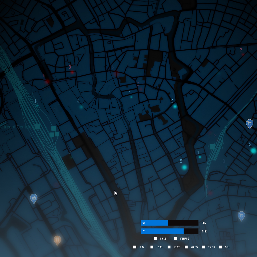
The uniqueness of this project lies in its ability to clearly pinpoint the best locations to reach specific target audience(s) at specific times over a period of 30 days. By tracking clusters of target groups, we only display data where we are certain that the selected audience is strongly represented at the given location(s).
TOUCH POINTS
Since I chose the center of Utrecht as the focus, my visualization is intended for entrepreneurs and businesses operating in this area, as well as advertisers looking to place advertisements or media content in this region.
Due to my interest in Facial Recognition Technology and the discussions regarding privacy policy during the feedback session, I aimed to focus my concept on a positive application of facial recognition that ensures the privacy of end-users while providing them with value for the application.
FOR NEW BUSINESSES
DESIGN STRATEGY
EXPANDING TAGS
In my ideal vision, I also wanted to collect additional attributes of city-goers, such as colors, patterns, and other visual variables to establish a style or archetype. Using this information, I would have added unique symbols for different archetypes to represent them on the map. Examples of these archetypes could be “Urban,” “Artsy,” “Trendy,” “Vintage,” “Punk,” etc. Due to technical limitations, I limited the visualization to age group and gender.
DATA MAPPING
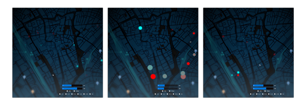
To realize this technically, I employed a grid of cells placed over the map. I then used mock data to fill the grid with random values corresponding to the actual longitude and latitude coordinates within the center of Utrecht. A scripting tool helped determine the extreme coordinates, and a random value generator created values between these extremes, which were then mapped over the grid cells. To make the data more understandable, I had to scale the ellipses or targets, depending on the age group.
UNDER THE RADAR
For the visualization, I drew inspiration from a sonar radar known from submarines. I chose this design because of its clarity, contrast, and simplicity, which easily draw focus. Combined with a map of the city center, it becomes a tangible “target map.”
INTERACTION
GHOSTING
To illustrate the difference compared to the previous hours, I experimented with adding ghosting effects. This leaves a trail of the previously displayed data. Additionally, I made adjustments to the targets on the map. Using the “PGraphic” data-type, I added a glow effect scaled based on the age group.
version 01

NOTEBOOK
Leveraging Multiple AI Models
Leveraging Multiple AI Models for Optimal Results In today’s AI landscape, different models excel in different domains. Strategic use of multiple AI assistants can significantly...
Cline Integration in VSCode
Cline Integration in VSCode Cline, a powerful command-line interface (CLI) tool for interacting with Claude and other AI models, has become increasingly popular among developers...
Prompting For Dummies 101
Prompting For Dummies 101 Crafting Effective Prompts BASICS To get the most out of your prompts, follow these proven prompting strategies: Be Specific and Structured...